Feeling boxed in by a small room? A well-chosen paint palette can make a dramatic difference—opening up a space, enhancing brightness, and inviting a sense of calm. Whether you’re refreshing a cozy bedroom, compact living area, or narrow hallway, strategic color selections and finishes can give the impression of more room and a lighter atmosphere.
1. Embrace Light and Neutral Tones
Walls painted in light neutrals reflect more natural light, creating a sense of openness. Shades like soft whites and pale beiges work to unify visual lines and visually stretch a room.
- Soft Whites: Popular shades like Benjamin Moore’s White Dove and Chantilly Lace offer clean, luminous backdrops.
- Light Grays: Mid-tone grays such as Sherwin-Williams’ Agreeable Gray and Benjamin Moore’s Gray Owl bring sophistication without overwhelming.
- Warm Beiges: Earthy neutrals like Benjamin Moore’s Pale Oak and Sherwin-Williams’ Accessible Beige blend warmth with breadth.
These light, neutral hues foster a cohesive canvas, eliminating harsh contrasts and making rooms appear larger.
2. Use Cool Colors to Create Depth
Cool-toned hues—including blues and greens—tend to recede visually, tricking the eye into perceiving greater distance and space.
- Airy Blues: Soft tones like Sky Blue or Breath of Fresh Air (Benjamin Moore) create an illusion of sky and add breeziness.
- Subtly Muted Greens: Calming options such as Sherwin-Williams’ Sea Salt or Benjamin Moore’s Soft Fern evoke tranquility while drawing the walls back.
- Soft Gray-Blues: Shades like Silver Mist (Sherwin-Williams) and Nimbus Gray (Benjamin Moore) blend sophistication with spaciousness.
By using these cooler tones, you can craft rooms that feel endlessly wide and serene.
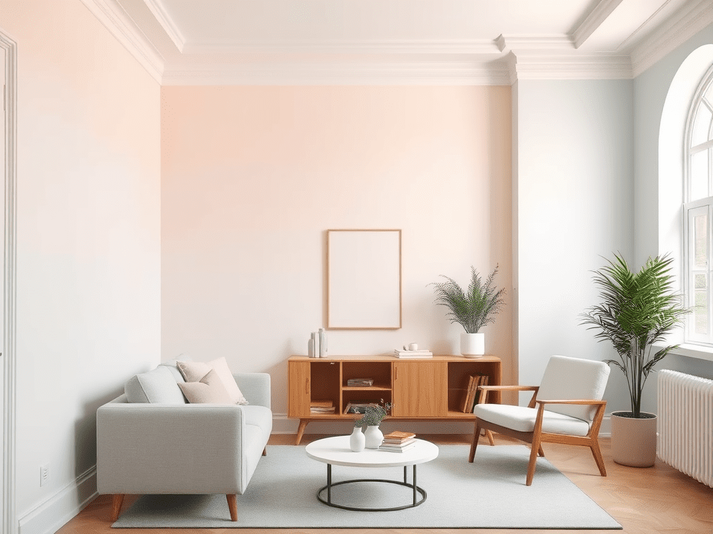
3. Accent with Pastel Hues
Pastels inject personality and cheer without overwhelming small spaces. When balanced with neutrals, they maintain that sense of lightness.
- Blush Pinks: Gentle blushes like First Light (Benjamin Moore) or Romance (Sherwin-Williams) bring warmth and brightness.
- Soft Yellows: Mellow yellows—Buttercream from Benjamin Moore or Lemonade from Sherwin-Williams—add sunshine without glare.
- Delicate Lavenders: Dreamy lavender shades such as Gentle Violet or Silver Peony (Benjamin Moore) add a serene, open feel.
These pastel tones punch up the aesthetic while keeping the airy, uncluttered vibe intact.
4. Opt for Monochromatic Schemes
Designing a room using variations of a single color creates visual harmony and an illusion of expansive flow. To do this effectively:
- Select one color and paint walls, trim, and ceilings in different sheens—perhaps matte on the walls and satin on trim.
- Introduce lighter and darker shades of your base color in decor, furnishings, and accents.
This seamless palette minimizes visual interruptions, making the room feel unified and, consequently, larger.
5. Apply High-Gloss and Reflective Finishes
Strategically placed gloss finishes can bounce light around, enhancing brightness and spaciousness. Consider these applications:
- Ceilings: A glossy or semi-gloss ceiling can reflect daylight and visually boost room height.
- Trim & Moldings: Shine on architectural details helps define edges while brightening the space.
- Accent Walls: A single high-gloss feature wall adds drama without closing in the room.
Use gloss finishes sparingly to accentuate features without overwhelming the overall aesthetic.
6. Additional Painting Techniques to Enhance Space
Complement your color strategy with these savvy refinements to reinforce the sense of openness:
- Match Trim and Wall Colors: When trim blends with the walls, it reduces visual divides and promotes continuity.
- Lighter Ceilings: Even a slightly lighter ceiling draws attention upward, adding perceived height.
- Harmonize Walls and Furniture: Matching furniture tones to your walls creates a seamless visual flow.
- Consider Reflective Paints: Specialty paints with a subtle sheen multiply available light, amplifying the openness.
Conclusion
A small room doesn’t have to feel cramped. By choosing light neutrals, cool undertones, or gentle pastels, and using gloss judiciously, you can completely transform your space. Monochromatic palettes and thoughtful finish selections further enhance the illusion of breadth. Whether your style runs classic, contemporary, or somewhere in between, one of these paint strategies can help you craft an environment that feels larger, brighter, and more welcoming.


